
B+W Engineering and Design has been doing civil and structural engineering across Los Angeles since 2011: hillside grading, drainage plans, hydrology, erosion control. The kind of work that happens before anything visible gets built.
They came to us with a simple ask: a banner for their construction sites. Something to hang on the fence so anyone walking past a job knows who engineered the project.
Simple ask, one real decision buried inside the request. That decision was the material, and getting the material wrong would have cost them a banner every few weeks.
The Problem With a Solid Banner on a Fence
A vinyl banner is a solid sheet of PVC. Vinyl looks fantastic. Colors are dense, blacks are deep, fine detail holds. If you are hanging that sheet on a wall in a lobby or behind a booth at a trade show, vinyl is the right answer almost every time.
Hang that same solid sheet on a chain link fence outdoors and you have built a sail.
Air cannot pass through vinyl, so the entire wind load has to be absorbed by whatever is holding the banner up. In practice that means the grommets, the zip ties, and the fence. Three things go wrong, usually in this order:
- Grommets tear out. The banner ends up hanging from one corner, flapping, doing the opposite of what a company banner is supposed to do for your reputation.
- The print rips. Once the material is loose the banner beats against the fence and starts to fail along whatever fold line the wind decided on.
- The fence moves. This is the expensive one. Temporary fence panels are held up by weighted feet, not concrete. A big solid banner in a real gust can bow a panel or take a section over.
People try to solve this with wind slits, literally cutting half-moon slots into a finished vinyl banner. Wind slits help a little. Cutting slits also puts holes in your artwork and starts new tears from every cut. Wind slits are a patch on a material choice, not a fix.
Why Mesh Was the Call
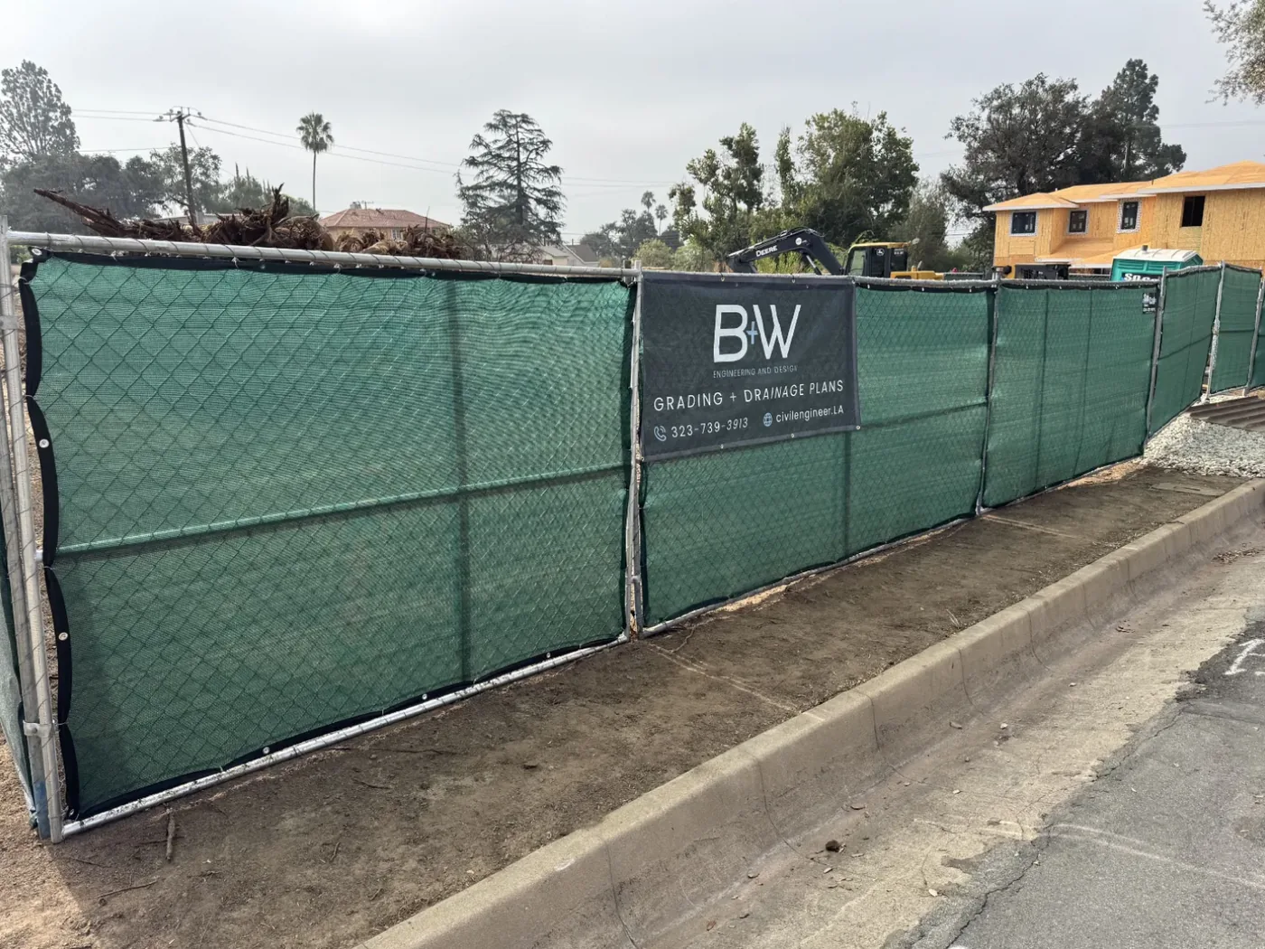
Mesh banner material is woven rather than solid, with open perforations across the whole surface. Roughly a third of the area is air. Wind goes through mesh instead of pushing against the banner, so the load on the grommets and the fence drops dramatically.
Airflow is the same reason you see mesh on scaffolding wraps and stadium fences rather than solid vinyl. The material is doing a job that has nothing to do with how the material prints.
Solid vinyl
- Maximum color density and detail
- Fully opaque, blocks the view behind the banner
- Catches the entire wind load
- Best indoors, on walls, or short-term events
Mesh: what we specified
- Open weave lets wind pass through
- Far less stress on grommets and fence
- Slightly lighter color, needs bolder artwork
- Built for chain link, scaffolding and long outdoor runs
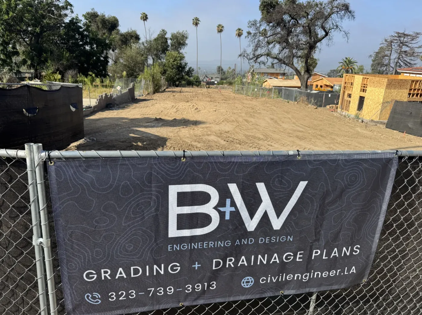
There is a real trade-off. Because part of the surface is open, mesh reads a little lighter than vinyl and fine detail softens up close. The softening is a constraint to design against, not a flaw to hide. So the artwork went bold: a large logo, heavy legible type, high contrast, nothing hairline that the weave would chew up. Read from a sidewalk twenty feet away, which is the only distance that matters here, the banner is crisp.
Where These Banners Actually Live
This is not a hypothetical wind problem. B+W cover roughly two dozen cities and neighborhoods across Los Angeles County, and the spread is exactly the problem: Malibu and the beach cities, the hillside neighborhoods through Bel Air, Silver Lake, Echo Park, Los Feliz, Mt Washington and Eagle Rock, and the foothill and Valley side out to Pasadena, Glendale, Burbank and Sherman Oaks.
One banner design has to hold up across all of that range: onshore wind at the coast, canyon corridors, exposed ridgelines, and the seasonal Santa Anas that rake the foothills. A material that merely survives a calm week in the Valley was never the brief.
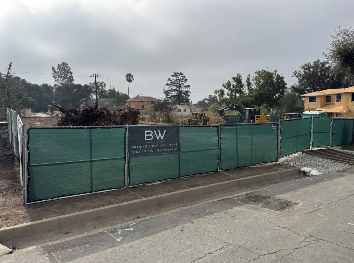
A significant share of that work is fire rebuilds. In Altadena and Pacific Palisades, the sites B+W are grading are lots where families lost their homes in the Eaton and Palisades fires and are now building back. Every banner photographed in this post is on an Altadena rebuild.
And the engineering behind the fence is not trivial. On the Punahou Street lot, 200 feet deep with fourteen feet of fall, B+W took the project over from another engineer and redesigned the drainage to drop the retaining walls and the sump pump entirely, moving water by sheet flow and pipe into lined rain gardens instead. That is a homeowner who no longer has a pump to maintain for the life of the house. Getting that right is consequential work, and the last thing anyone on those streets needs is a torn banner beating against a fence.
The banner had to hold up for months without becoming one more thing to manage.
Print One First
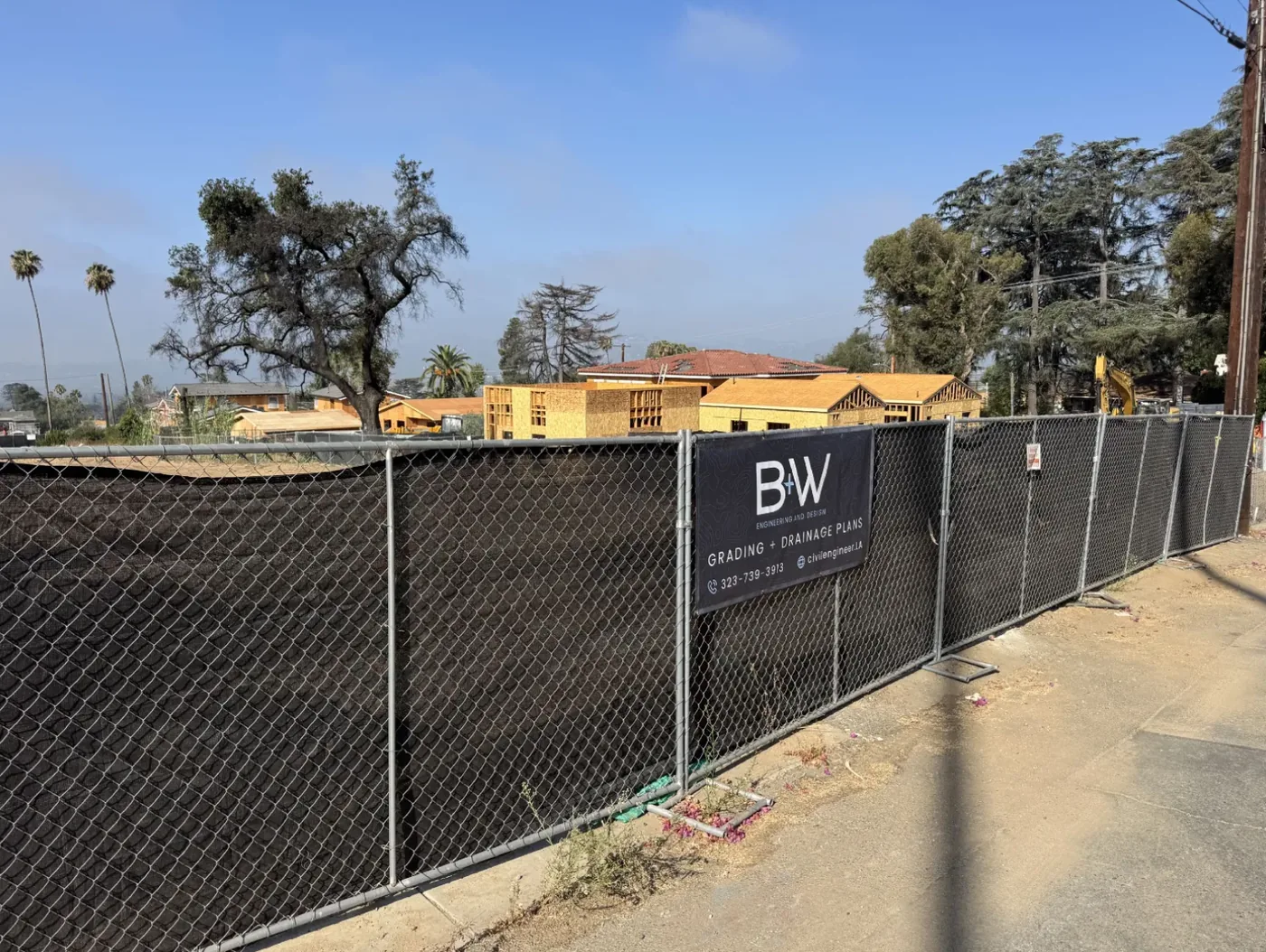
We printed a single banner and hung the banner. That was the entire plan for phase one.
This is the part we would push any client toward, and enough people skip the step that we will spell the process out: on a repeatable item that has to survive real conditions, print one, put the banner in the actual environment, and go look at the result. Not a proof on a screen. Not a sample swatch. The real thing, at the real size, on a real fence, in the real wind.
A test print costs one unit. Finding out you chose the wrong material after a run of fifteen costs fifteen, plus the reprint, plus the weeks in between where every job site is showing customers a shredded banner carrying your company name.
The test went perfectly. Nothing tore, nothing sagged, nothing needed rehanging. So B+W moved to the obvious next step: a banner for each location, printed as new sites come online.
Need something that has to survive outside?
Banners, site signage, fence wraps. We will tell you which material fits your conditions before you commit to a run, and print one first if that is the smart move.
The Banner Was Never Just a Banner
Designing the banner meant solving something bigger first. B+W had a logo they liked and no system around the logo. Nothing told them what the brand looked like once the brand had to be more than a mark on a letterhead.
We left the logo alone. The mark worked, they were attached to the mark, and rebranding a company that has been trading under a name since 2011 is a solution looking for a problem. What they needed was everything around the mark.
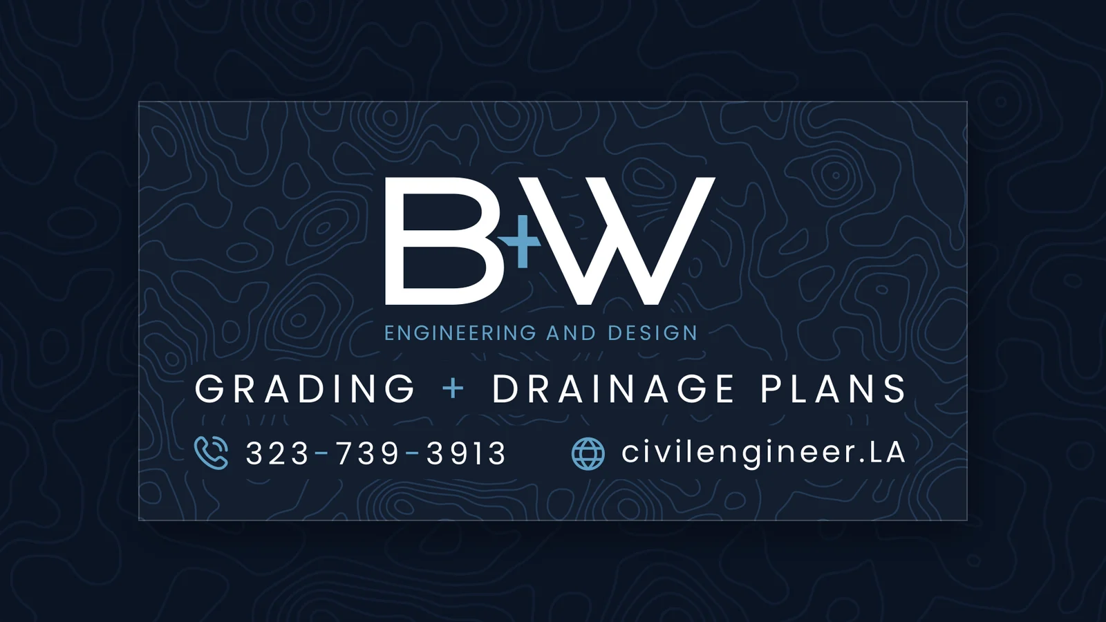
The obvious material was sitting in their own deliverables. B+W spend their working lives in topographic survey maps, the contour lines that describe how a hillside falls. So we built the identity out of that: a topographic contour pattern, drawn in their blues, that reads as texture from across the street and as a survey map when you are standing next to the pattern.
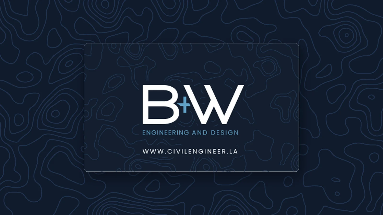
The contour pattern is a small idea that does a lot of work. An engineering firm using topography as its brand texture is not decoration. The pattern says what the firm does before anyone reads a word. And the pattern scales cleanly from a business card to a four-foot banner without ever looking like clip art.
We delivered the identity as a package: the pattern in multiple weights and crops, the logo prepared for dark and light backgrounds, and the supporting pieces already built on the pattern: business cards, stickers, banner artwork.
Then the part you cannot plan for. B+W liked the direction enough that they carried the work into their own website. We did not build that site. They took the visual language and ran with the system, which is the test of whether an identity works: does the client reach for the system when we are not in the room?
What's Next: Engineering as a Streetwear Brand
The current project is apparel, and the brief is the most fun thing we have been handed in a while.
Most engineering firms do company shirts the same way: a polo, a chest logo, done. Nobody wears the polo anywhere they don't have to.
B+W want the opposite. The goal is pieces the owners want to wear to client meetings, walking a site, out in the world, designed with the sensibility of a streetwear label rather than a corporate merch catalog. Real garment choices, considered placement, graphics built from the contour system instead of a logo slapped on a chest.
The strategy underneath the fun is sound. A shirt someone chooses to wear is worn constantly. A branded polo sits in a drawer. If your company apparel is good enough that your team wants the pieces, your brand goes to every meeting, every site visit and every weekend, and that is a marketing channel most firms are leaving completely unused.
That work is in progress. We will post the apparel when the pieces are on bodies.
What to Take From This
- Ask what the material has to survive before you ask what the piece should look like. The prettiest print in the wrong substrate is a disposable print.
- Print one first. On anything repeatable, a single test unit in real conditions is the cheapest insurance you will ever buy.
- Design for the constraint, not around the constraint. Mesh softens detail, so the artwork got bolder. That is the job.
- You usually do not need a new logo. Most brands that feel thin have a fine mark and no system around the mark. Build the system.
- Pull the visual language from the actual work. B+W's contour lines were already theirs. The strongest brand assets are usually sitting in the deliverables.
If you are running a construction, engineering or trade business and your site presence is a generic banner from a big-box print portal, that is a cheap thing to fix and that banner is working on you every single day whether you designed the banner or not. Our printing prices are published openly, and branding and identity and print design and packaging cover the rest.
Let's figure out what your sites should be saying
Thirty minutes. Bring your logo, your job sites and your conditions, and we will tell you what to print and what the run will cost.
Frequently Asked Questions
Use mesh for anything mounted outdoors on a chain link or temporary fence, especially in windy or hillside conditions. Mesh is a woven material with open perforations that let air pass through, so the banner does not act as a sail. Solid vinyl is the better choice indoors, on a solid wall, or for a short-term event where maximum color density matters more than wind performance.
Solid vinyl catches the full wind load because air cannot pass through vinyl. That force has to go somewhere, so the load goes into the grommets, the zip ties and the fence itself. Typical failures are grommets tearing out and leaving the banner flapping from one corner, the banner ripping along a fold line, and on temporary fence panels that are only held by weighted feet, whole sections bowing or going over. The banner is rarely the most expensive thing that breaks.
Mesh looks slightly different, not worse, and you design around the weave. Because roughly a third of the surface is open weave, colors read a little lighter and fine detail loses crispness up close. From ten or twenty feet away, which is how a fence banner is actually seen, the difference is hard to notice. The practical rule is to use larger type, high contrast, and avoid hairline strokes or small print that the weave will break up.
Order the banner with grommets every 18 to 24 inches around the full perimeter and fasten every single one, not just the corners. Heavy zip ties or bungee balls both work; bungee balls give the banner a little travel in a gust instead of concentrating the load on the grommet. Pull the banner taut rather than leaving slack, because a loose banner has room to build momentum and beat itself against the fence.
A properly hung mesh banner with UV-stable inks will generally give you a year or more of continuous outdoor exposure, and often considerably longer. Lifespan is driven far more by how the banner is mounted than by the material. Banners that fail early almost always failed at the attachment points, not in the middle of the print.
For a fence-mounted contractor banner read from the street or sidewalk, somewhere in the range of 2 by 4 feet up to 4 by 8 feet covers most situations. The right answer depends on your viewing distance and how much fence you have. Size the banner so your company name is legible from where people actually pass by, then cut everything else on the banner that does not survive that test.
Rules vary by jurisdiction and by what the sign says, and the City of Los Angeles, LA County and individual cities like Malibu and Pasadena each handle temporary construction signage differently. Contractor identification on your own active job site fence is commonly treated differently from advertising signage. Check with the permitting authority for that specific site before assuming, since the site may already be subject to conditions from its own approvals.
Vector artwork is best: an AI, EPS or PDF with live vectors and outlined fonts scales to any banner size without softening. If you only have raster art, we need the file at roughly 100 to 150 DPI at the final print size, which is far less than print resolution for paper because a banner is viewed from a distance. Send us whatever you have and we will tell you honestly whether the art will hold up at size or needs rebuilding first.